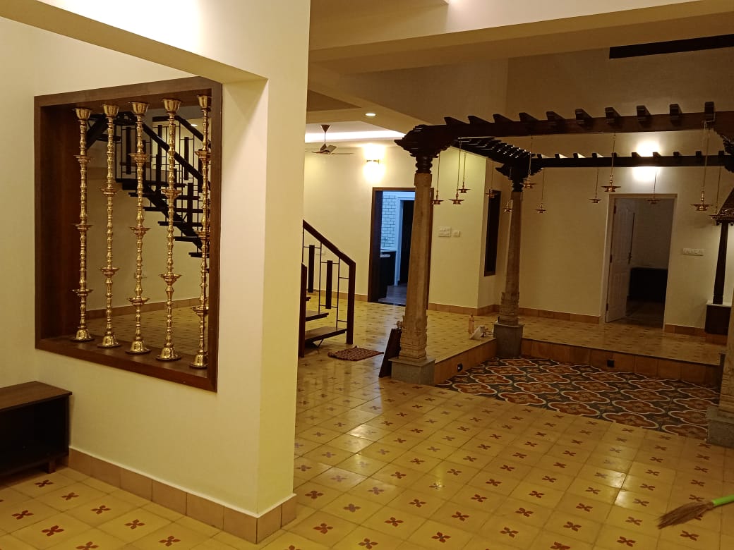
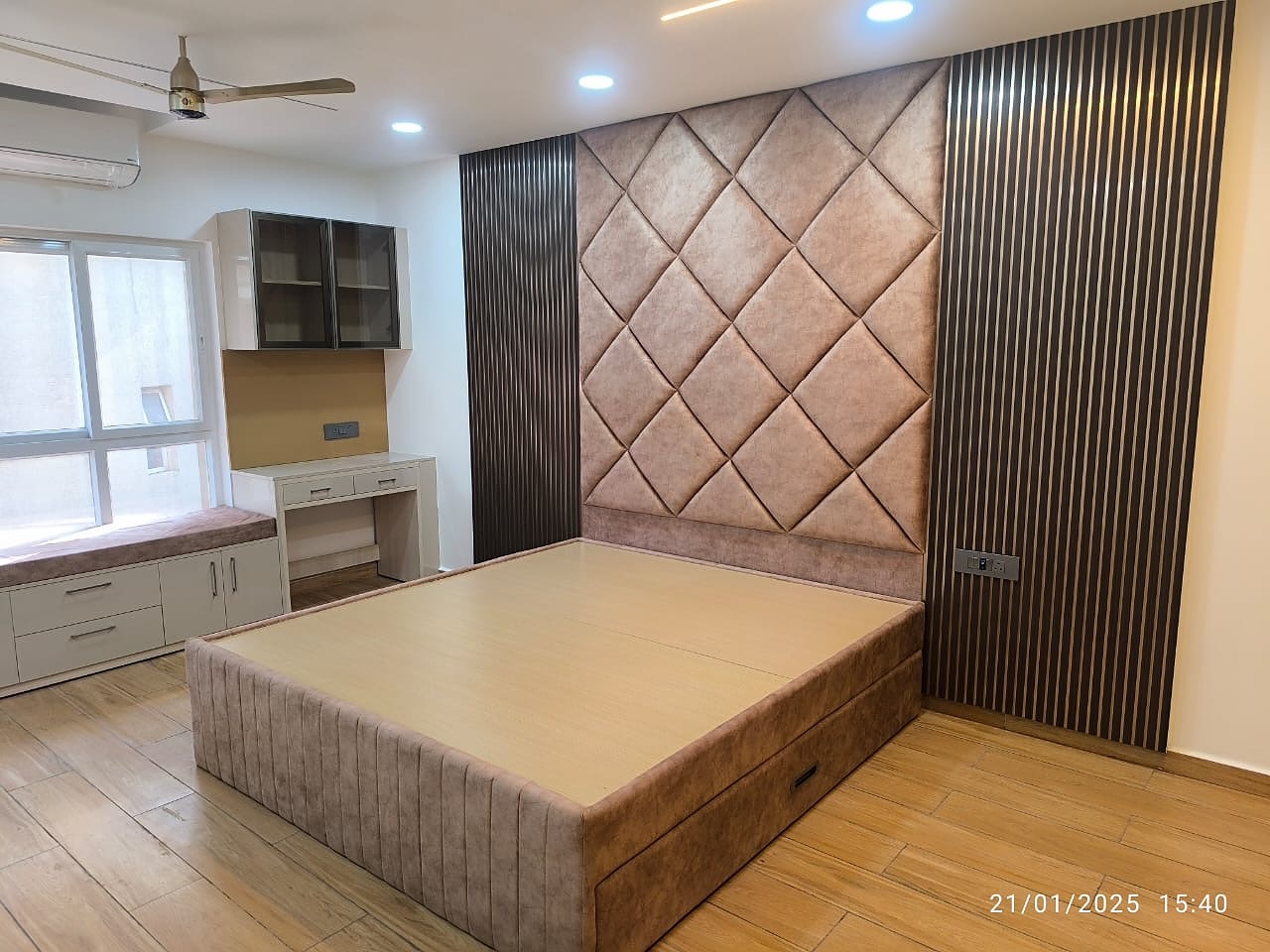
Ask most Chennai homeowners about interiors and you will hear the same word: safe. White, beige, a touch of wood. But the homes people remember are the ones with a little courage — a blush-pink kitchen, a deep blue study wall, a lilac wardrobe with a glowing yellow niche. Colour, used well, makes a flat feel bigger, brighter and far more personal.
Here are colourful interior design ideas drawn from real homes we have designed across Chennai, plus the practical rules that keep bold colour looking elegant instead of overwhelming.
1. A Soft Blush Kitchen That Feels Fresh, Not Fussy
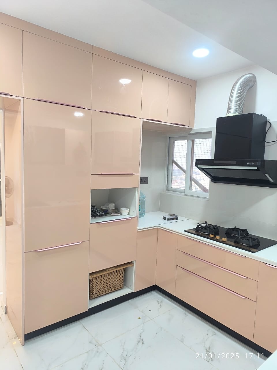
Pink in a kitchen sounds risky, but a muted blush or peach laminate in a high-gloss finish reads as calm and modern. Paired with white quartz counters, white marble-look flooring and a black chimney, it stays sophisticated. Glossy finishes also bounce light around, which helps small Chennai kitchens feel more open.
Tip: keep the counter and floor neutral and let the shutters carry the colour.
2. A Deep Blue Study Nook That Adds Instant Drama
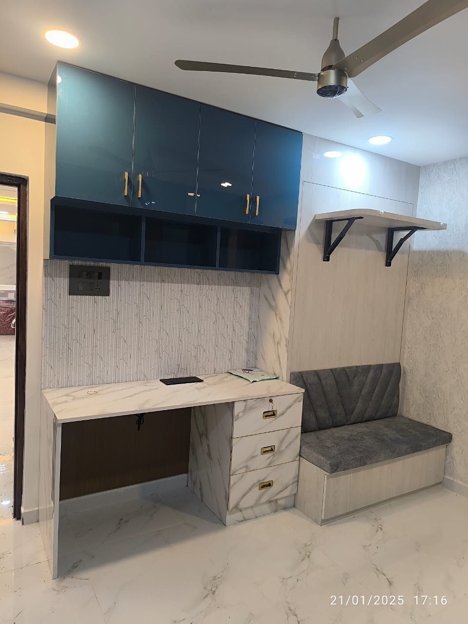
Dark blue overhead cabinets above a marble-finish study desk give a corner a premium, boutique look. The light textured wall behind keeps it balanced, and a grey upholstered seat with a chevron pattern makes the nook useful as both a work desk and a reading spot. Gold handles tie the whole arrangement together.
Tip: use a strong colour on the upper cabinets only, so the room never feels heavy.
3. A Lilac Wardrobe With a Glowing Yellow Niche
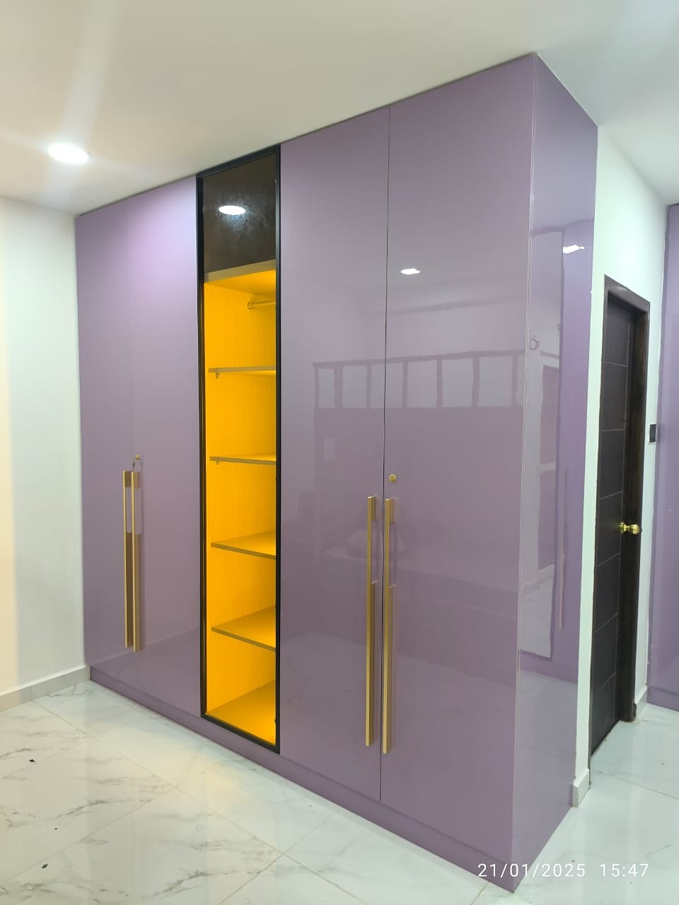
This is the kind of detail clients photograph first. A lilac glossy wardrobe with long gold handles, broken by a backlit yellow open niche, turns a storage unit into a feature. The yellow glow doubles as a display shelf for decor and a soft night light.
Tip: a single contrasting accent inside a calm base colour is the easiest way to add character.
4. A Yellow-Glass Sliding Wardrobe for the Bedroom
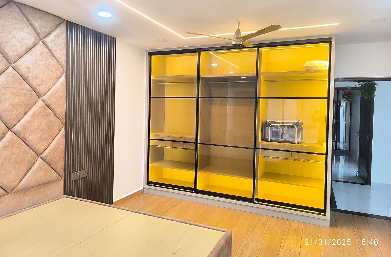
Tinted glass in sunny yellow with slim black frames gives a bedroom wardrobe a contemporary, gallery-like look. Sliding doors also save the swing space that fixed hinged doors need, which matters in most Chennai apartment bedrooms.
Five Rules for Using Colour Without Regret
- Follow the 60-30-10 rule. About 60% neutral base, 30% secondary colour, 10% bold accent.
- Choose finishes carefully. Gloss for compact rooms that need light; matte for large rooms where you want a quieter feel.
- Test in real light. Chennai’s strong daylight changes shades a lot, so check laminate or paint samples at different times of day.
- Repeat colours. Echo a shutter colour in a cushion, curtain or artwork so the palette feels planned.
- Use metal as a neutral. Gold or brass handles and trims lift almost any colour combination.
Colour Combinations That Work in Chennai Homes
| Room | Combination | Feel |
|---|---|---|
| Kitchen | Blush pink + white + black | Fresh, modern |
| Study / Work corner | Deep blue + marble white + gold | Focused, premium |
| Bedroom | Lilac or taupe + wood + yellow accent | Warm, personal |
| Living room | Warm wood + grey + one teal wall | Balanced, welcoming |
Want Colour in Your Home?
If you are planning a new home or a renovation in Chennai, our team can help you choose a palette that suits your space, light and budget — and show you how it will look before work begins. Message us on WhatsApp for a free consultation.